How to design a lead capture form

When creating a lead-capture form (also known as a lead-generation form), keep in mind that design has a significant impact on conversion rates.
Design goes beyond colors and logos. It's how form fields are arranged, whether buttons are easy to spot on mobile, how much space sits between answer options, and whether text is readable at a glance.
If the form itself creates friction, potential customers won't finish it. They'll bounce. And you'll wonder why your conversion rate stays low despite decent traffic.
Design removes obstacles between someone landing on your landing page and you capturing their information. Every unclear label, every cramped layout, every low-contrast button adds friction. Fix these issues, and the same traffic converts at higher rates without changing your offer or ad spend.
The specific design choices that set high converting forms apart from underperforming ones come down to layout, spacing, and color.
Design decisions made while building your lead generation form determine conversion rates once it's live. Get them right, and more potential customers will complete the form.
Designing a lead capture form
Your brand colors and logo should show up consistently throughout the entire lead form design. Even if you start with a pre-built template from your form builder, customize it to match your brand identity.
This isn't just about looking pretty (though that helps). It's about making users feel like they're in the right place and that your business is legit.
When forms match your brand identity, users see them as more trustworthy and professional.
Every slide step of your multi-step form should include:
- Your logo is in the same spot every time
- Your primary brand colors on key elements
- The same visual style as your website
- A polished design that shows you care about quality
People convert better on forms that look professional and feel good to complete. It's not shallow—it's just how we make decisions.
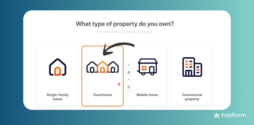
Lead Capture Form Layout
The way you arrange your form affects how fast users can read and answer questions. There are three main layout options for multi-step forms:
- Card
- Grid
- List
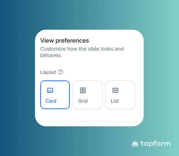
Each layout serves a specific functional purpose, so it's essential to select the correct one.
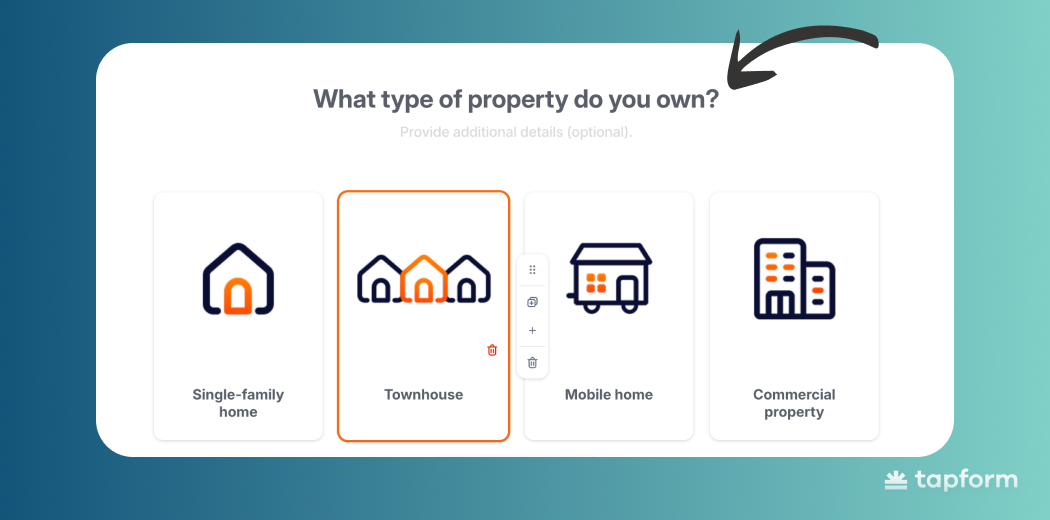
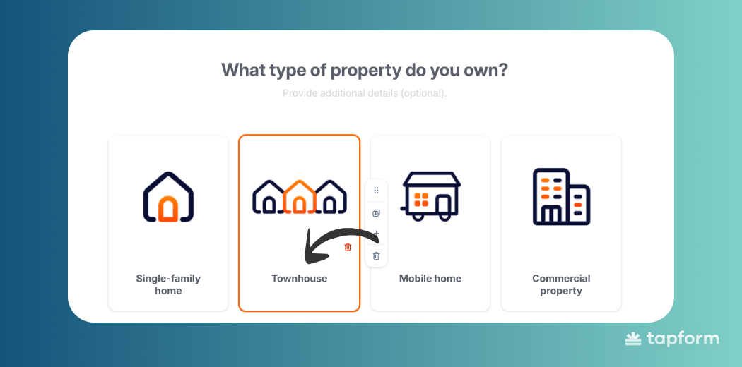
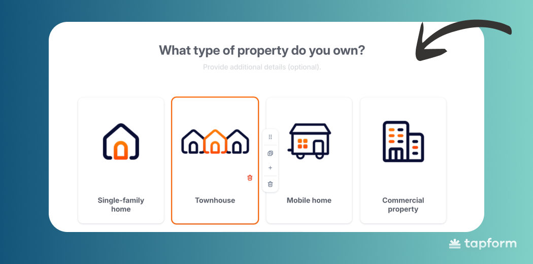
- Card Layout — When you want each option to feel like its own important choice.
- Grid Layout — When users need to compare options side by side without scrolling.
- List Layout — When you have multiple options and users need to scan through them quickly, especially on mobile.
From Slide Design
Once your brand colors and layout are set correctly, the next step is to style each slide in your multi step lead generation form. Think of this as the finishing touches that tie everything together.
Here's what you should style on each slide:
- Text color of the form
- Background color of the form
- Background color of the answer
- Text color of the answer
- Button colors
- Form answer style
When all these elements match across every step, the form feels right. It's smoother, more trustworthy, and easier to finish.
Text color of the form
Keep the primary text color the same on every slide. And make sure it's easy to read.
Consistency helps users instantly understand what you're asking them. Also, stick with the same font throughout the entire lead form.
It keeps everything looking professional and unified.
Text color of the answer
Keep the text inside your answer options clear and readable. You can change the answer text color per slide if needed, but matching it to your main question text works best.
This keeps everything visually organized and makes it easier for users to scan through their options.
Background color of the form
Use any background color you like, but white is usually your best choice. A neutral background keeps things clean, reduces visual clutter.
Your background color affects everything else - text, answers, buttons all need to work with it. If you're not a designer, stick with simple color combinations and skip the dramatic contrasts.
Background color of the Answer
Each answer needs its own background that's distinct enough from the main form so users can tell which parts are clickable. When answers are easy to spot, people make decisions quickly.
Not sure what color to pick? Use the same approach as your form background: simple combinations with decent contrast.
Button colors
The button is what moves users forward on each slide, so it needs to be obvious. If someone has to hunt for the button, something's wrong. Pick a color with strong contrast that shows them exactly where to click next.

Choose something that doesn't blend with your background or answer colors. The button should be the most noticeable element - the clear next step.
A button that grabs attention keeps users moving through your form smoothly, which means more people actually finish it.
Widgets & Popups
Widgets are small call-to-action boxes that appear at the bottom of a website, designed to capture visitors who are already interested in the services the website provides. Their role is to give users the final push to complete a conversion.
In the form widget, you can customize almost everything:
- logo
- title
- label
- button style
- colors
A strong call to action within the widget is essential because it’s the primary trigger that motivates users to open the form.
Short, benefit-focused messages like “Get estimate for free” or “Get our offer” work best, as they clearly communicate what the user will gain.
In Tapform form builder, you can choose between light and dark widget themes depending on your website design. You also control when the widget appears or hides based on scrolling behavior. This way, the form remains available when users need it, without becoming intrusive or annoying.
Popups work the same way, but they trigger at specific moments—when someone's about to leave your landing page or hasn't done anything for a bit. They capture leads that would otherwise bounce.
Mobile UX
Most people will see your form on their phone. Not their laptop or desktop.
So the design has to work for quick taps, readable text, and one-handed use. If it's awkward on mobile, you'll lose leads immediately.
Good multi-step lead capture tools today are built for mobile from the ground up. They adjust spacing and layout automatically for smaller screens.
Buttons need to be where your thumb naturally goes, answer options need space between them, and scrolling should be kept to a minimum.
Mobile-first isn't a bonus feature anymore. It's the baseline. When a form works smoothly on a phone, people finish it. More leads, better data, higher conversions - all from traffic you already have.